Mobile First vs Mobile Responsive Design
Designing for the devices your customers are using

Mobile First vs Mobile Responsive Design
Mobile browsing is here to stay. At Smartz, we believe that today's business needs to understand the needs of mobile users in order to design websites and marketing materials that are just as easy to view on a smartphone or other mobile device as they are on a desktop. Yet small screens present a significant problem to the developer. How can you create a site that works both on mobile and on the desktop, in spite of the significant drop in screen size between the two?
The Smartz team designs for both desktops and smartphones. We understand the unique needs of both platforms, and have proven strategies to use to ensure the user experience is protected. As you are deciding how to effectively reach the growing market of mobile users, you must decide if you will take a mobile-first design approach, or a responsive design approach. Here's what you need to know about these two options.
About Mobile First Design
Mobile first design is exactly what it sounds like - a design that puts the mobile user experience first. The initial site design, which contains all of the important elements, is designed for the mobile user. It eliminates elements in the initial design, like hover effects and animations, that don't translate well to mobile. By removing these things at the outset, the mobile-first design ensures that all users are able to access the site's most critical features and content.
As the devices increase in size and capabilities, the website is enhanced with additional content or features to become more robust. By utilizing this strategy to create a site, the site's builder is able to focus all of the creative energy in the initial build on creating a streamlined, simplistic site that looks and functions impressively on the mobile device. While the desktop user may have even more, nothing that is critical is cut from the mobile design.
In other words, with mobile first design, the mobile design is the basis on which all other designs are built. It contains everything the user needs to fully experience the website, with no essentials missing. This means that everyone who accesses the site, no matter what platform they use, has the information they need to make the right decision about your company.
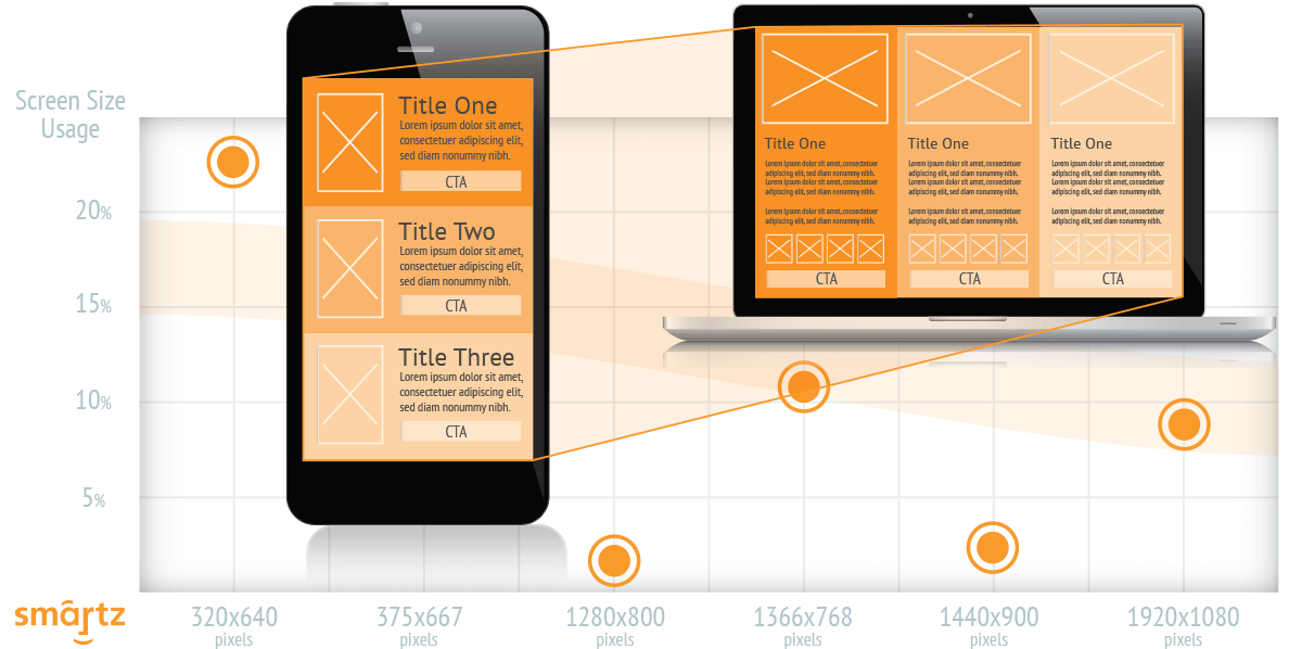
Mobile First - Distilling the Essential Information
In mobile first design, visual real estate is extremely limited. Scrolling is an option but not preferred. The essential information your customers need should be pared down to the bare minimum. Supplemental details can be hidden on mobile screens but shown to customers visiting your site on larger screens.
Mobile first design only displays the essential info your customers need.
On larger screens, supplemental information can be added when visual real estate isn’t as valuable.
About Responsive Design
Responsive design takes a different approach. With responsive design, developers will build a website for a desktop platform. As the screen size shrinks for mobile devices, the site will respond and show a mobile-friendly version of itself. However, that mobile-friendly version is often lacking many of the necessary elements that make it effective on the computer. In other words, the user experience is "cut down" as the device gets smaller. Unfortunately, starting with the larger design almost always means something critical gets lost.
Smartz Strategy - Mobile First
At Smartz, we have been in the web design and online marketing business since 1996. We have watched the birth and growth of mobile marketing, and clearly see the future. While mobile hasn't yet passed desktops, it's becoming a larger part of the target marketing for our clients, and now is the time to adapt your web design strategy to reach people on any size of screen or any device. That's why we advocate a mobile first approach to web design.
With mobile first, you ensure that all of your users have a good user experience. Mobile first forces you to scale down your layout to the essentials, and this means your content is exactly what you need. By starting with mobile, your end result will be more effective and attractive, on all screens.
Yet, we also realize that a mobile first design does have one drawback. Some of the interactive features you want on a website require animations and plugins that simply do not work well in a mobile design. How can you continue to have this type of interactive experience on a mobile device? The answer is supportive app design.
When we take on your mobile web design project, we will also offer you the opportunity to design an app that supports the efforts of your design. By inviting users to download your app, you can achieve the same interactive abilities common on a desktop, without cluttering up your mobile site. Simply move those interactive features to the supportive app, and encourage your site visitors to use both. Merging supportive app design with a mobile-first strategy creates an effective mobile presence.
Make the Smart Move with Mobile-First Web Design
Mobile first web design is not easy, but with the right marketing and design team on your side, it is an effective option. Smartz works with both mobile and desktop designs, and will take you through the process of designing for mobile first, then adding to the site to make it attractive to desktop users as well. By focusing on content for a small screen first, then adding to the layout for larger screens, your company's website can adapt to the coming mobile era.
Are you ready to get started on your mobile first design? Contact the team at Smartz today to learn more about how you can optimize your user experience by designing for a mobile platform first!